


個展「呼呼応応」 SATOSHI KOYAMA GALLERY (東京)2011
Exhibition “KOKOOUOU” SATOSHI KOYAMA GALLERY (Tokyo) 2011
この個展では、東日本大震災の後、たくさんの情報や人の声が交錯している中、自分(鑑賞者)は何を発するのかというというのを表現した呼応作品を制作した。孤独でもあり、囲まれているようでもあり、不安定なその時の状況をどのように表現できるかを試行錯誤した作品でもあった。
In this solo exhibition, I was thinking what I should express to the world after the Great East Japan Earthquake. I tried to express the situation of loneliness, surrounded, and also full of enxiety. This was also a work which I made lots of try and errors. Here is the introduction from Mr. Satoshi Koyama who held the exhibition.
ここに個展を開催したギャラリーの小山聡氏の個展紹介文を掲載する。
展示会紹介文
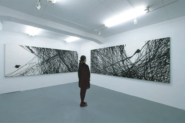
空中での筆の軌跡が縦横無尽に広がり、ギャラリースペースを埋め尽くす。そこにある「呼応」の「呼」の点。それはどこに向かい、どのような軌跡をたどるのか。留まることなく発展し続ける川尾朋子の「呼応」シリーズ。本展では、幅3メートルを超える大作2点を含め、6点を展示する。
本展を開催するにあたって、私は強い“信念” を持っている。それを支えるキーワードを、いくつか述べさせて頂きたい。
[①Simplicity, universality / 川尾朋子の仕事はシンプルである。]
点を打ち込み、放つ、それを受けるかたちで再び着地する。放たれた点は時に素早く、時にゆったりと、次に着地するべく点へと運ばれる。その繰り返しで画面が埋められていく。その結果、画面に定着するのは、点と線、それに空中での動きによって、時折垂れ落ちた滴のみであり、そこにシンプルでリアルな美しさがある。こういったスタイルは、一見アメリカ現代美術における抽象表現主義の習作と捉えられがちであるが、単なる行為そのものの主張ではない。そこには“書” というジャンルに身を置いて活動している、川尾のアイデンティティそのものが放出され、定着しているのである。いわゆる書作品の鑑賞法として、書を嗜む者が当たり前のように行うのが「追体験」である。線を引くスピード、跳ね上げるタイミング、次の形状へ移る時のリズムなどを、その作品の前に立ち、辿っていく事によって、観る側と書き手との同調や差異の妙を味わう事ができる。勿論、油彩画や写真作品でもある程度制作プロセスを想像して楽しむ事は可能であるが、事後編集を行わない、Single-layered な技法(川尾の言葉を借りると、「一発勝負性」) である故に、その追体験の密度がはるかに高い。川尾朋子の作品の魅力は、観る側と作り手とが繋がる事に、鑑賞者を選ばない普遍性(Universality) にある。
[②Identity color / 川尾朋子の“黒” は必然である。]
彼女がモノクロームに拘る理由は、幼少より長く関わってきた伝統芸術、“書” における美意識が深く関連する事は言うまでもない。そして、その墨の美を追求する事は、前述した、彼女のアイデンティティの放出に他ならない。藤田嗣治の白、イヴ・クラインの青などと同様に、川尾の黒は、作品にとって重要なファクターである。故に、墨の調合を探求する事は、アイデンティティの追求と同義なのである。
[③correlation / 「呼応」]
前述に加え、川尾が近年ライフワークとしているテーマが、「呼応」である。2009 年の福岡での公開制作は、和室を隔てた二枚の襖戸に、始点と着地点を打ち込み、その後襖戸を開け、観客が点と点の間を通るといった試みを行った。また、地元京都での個展では、ギャラリー自体を真っ黒な空間に仕立て上げ、点を打ち込んだ対となるパネル作品を、天井から幾重にも吊り下げ、その点と点の間を、鑑賞者の導線とする演出を行っている。共通して言える事は、彼女の打ち込む点、そして点と点を結ぶ、目には観えない感覚を共有する事、自身が日本人として大切にしている “行間を読む” つまり“察する”というコミュニケーションが、すべての作品の根底にある。
川尾朋子が掲げるテーマ「呼応」。その作品と活動の先には、日本の芸術、或いは墨を使った、伝統的な作業に裏打ちされた、「狭くて深い芸術」としての観念から、グローバルなコミュニケーション・コンセプトへと羽ばたく姿がある。その可能性に、私の期待は膨らむばかりである。
2011 年9月 SATOSHI KOYAMA GALLLRY 小山聡
Introduction of the exhibition
The movement of the brush in the air shows the inexhaustible spread into the gallery space. The dot of the “calling” which is there. Where does it do and and what kind of trace does it shows. The gallery is filled with the work of “ko-ou” which Ms Tomoko Kawao creates. It has no limit and keeps developing further. In this exhibition, you can see six works which includes 2 masterpieces with the width more than 3 meters. To hold this exhibition I have a very strong belief. Let me explain my belief using the two key words.
[①Simplicity, universality / The work of Tomoko Kawao is very simple]
Write a dot, throws and receive and land again. The dot with has released sometime moves fast, sometime moves slowly toward the next point. The screen is filled with the repetition of these movements. As the result, what is left on the screen are the dots and lines, and the drops falling from the movement of the brush in the air. There, I find the beauty of simplicity of her work. At the first glance, this style of work, looks like study of an abstract expressionism American contemporary art, however it not just an assertion, there is an identity which Tomoko Kawao releases and establishes as a calligraphy artist. The most common way to appreciate the calligraphy writing is by re-experiencing the writing. The speed of writing the line, the rhythm to move up the brush, the rhythm to go to the next shape, these are all appreciated when standing in front of the art piece. This allows the artist and the viewer to sympathize and enjoy the difference, too. Certainly with oil painting or photo works we can enjoy by imagining the process of the production. Unlike those works, her calligraphy is a single-layered and does not consist any editing to finish up the piece. (Kawao calls it “one time serious match”) It makes the density of re-experience much higher. The attraction of Tomoko Kawao’s art is that it connects the viewer and the producer and does not chose the viewer. It is universality.
[② Identity color/ Tomoko Kawao’s black is certain]
It is obvious to say that the reason she is attached to monochrome comes from her background that she had always been involved with the beauty of the traditional calligraphy since she was a child. And the fact that she pursuit the beauty of the ink is the releasement of her identity. Like the white of Tsuguharu Fujita, the blue of Yves Klein, Kawao’s black is the important factor for her work. Therefore, to pursuit the compound of the ink formula is as important fact as the pursuit of the identity.
[③ correlation/“ko-ou”]
Adding to the work I have mentioned before, another theme Kawao has been working as her life work, is “ko-ou”. (calling) At her open exhibition in 2009 in Fukuoka, she used the two screens in the Japanese tatami room, wrote the start dot and the end dot, then opened the screen so that the spectators could walk through the two dots. At her exhibition in her hometown Kyoto,she made a black space, she prepared a panel work with the black dot and hanged from the ceiling in many layers, so that the spectators can walk through those panels. What I can say, is that in her work she writes the dots to share the feeling of the unseen lines connecting the dots, is the important value she shares as a Japanese. Those are the common values I can see in all her works. In other words, the values Japanese people admires the most, “to read between the lines” and to “presume”. Those values are at the bottom of her work.
Kawao’s theme “ko-ou”.(calling) I can see her figure going beyond those works she had already accomplished. I see Kawao’s “narrow and deep” Japanese traditional are work spreading the wings to a global communication concept art. My expectation rises more and more.
Satoshi Koyama
SATOSHI KOYAMA
September 2011