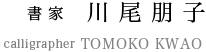


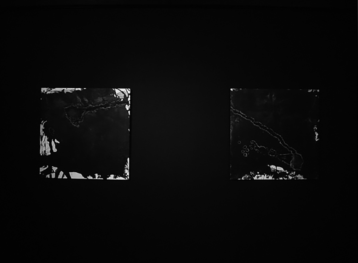
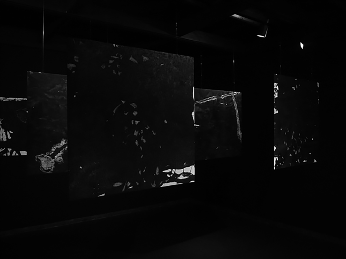
個展「呼応」川尾朋子 Gallery H2O (京都)2009
Solo exhibition “Correlation” Tomoko Kawao Gallery H2O (Kyoto) 2009
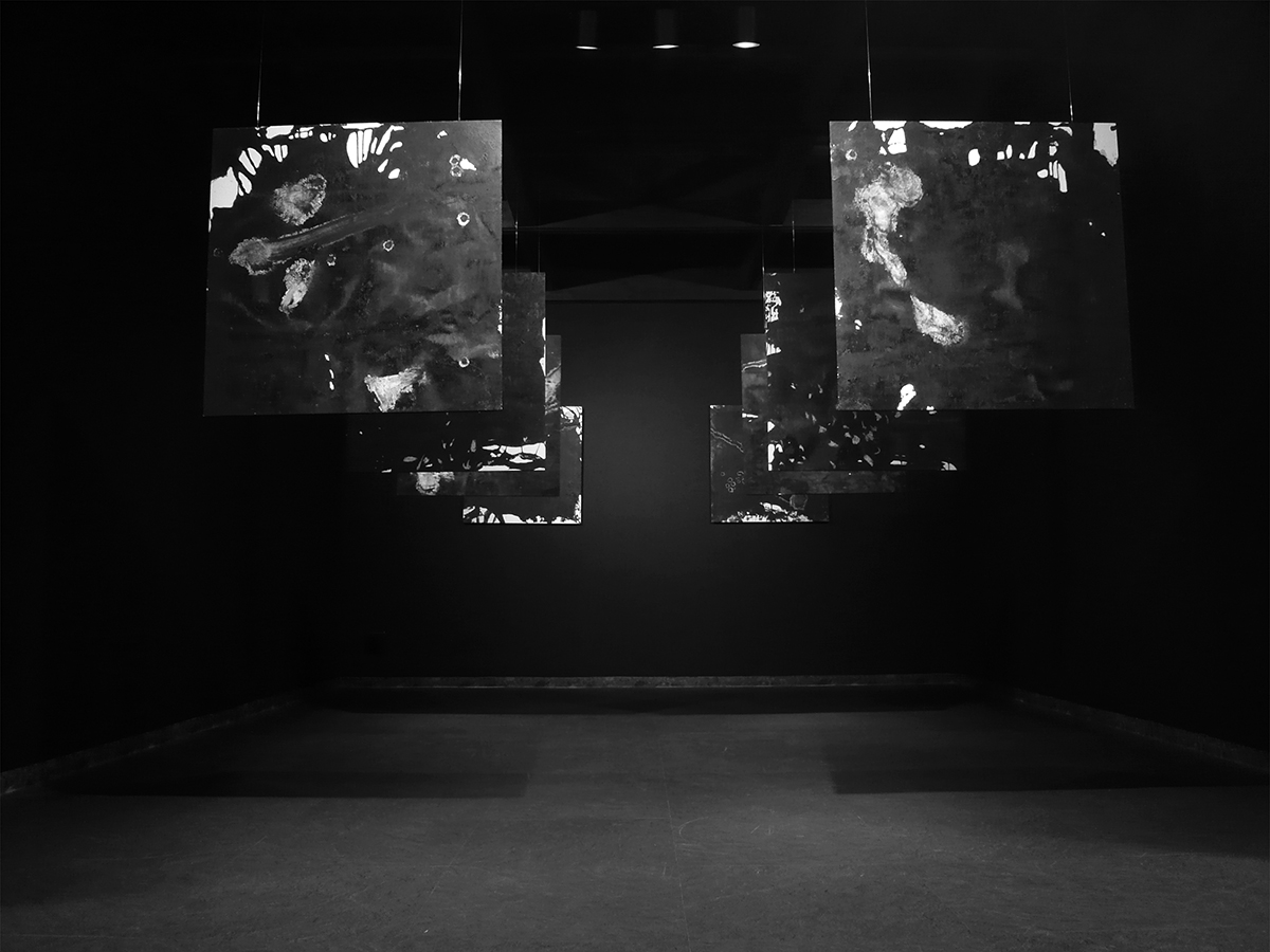
呼応という作品タイトルは、2つの側(点)の間にある筆の軌跡にフォーカスしたものなので、「呼ぶ」点と「応える」点を1つで表せる呼応という言葉を選んだ。
作品に見える2点は、ひらがなの「い」を書くときをイメージするとわかりやすいかもしれない。ひらながの「い」の一画目を「呼ぶ」点、二画目を「応える」点と考えると、一画目と二画目の間には筆が紙面を離れる瞬間がある。
制作時には紙を2枚離して置き、1枚目に「呼ぶ」点、2枚目に「応える」点を書いた。墨の中に水を弾く液体で白い点が浮かび上がるようにした。壁紙も全て黒に塗り直し、白い点が暗闇にある光のように、その軌跡を想像しやすいのではと考えたからである。
そして、書作品と人間は、対面での鑑賞方法がほとんどなので、2枚の間を離すことにより、そこを人が歩いて通過できるようにし、筆の軌跡を横切るイメージで、
筆の軌跡がそこにあることを感じられる展示方法にした。
2点の間にあるものを想像することが、鑑賞者が呼応しているその間にあるものを想像することや気づきにつながればという願いを込めた展示であった。
The title “ko-ou” meaning correspondent in English, has been focusing in the movement of the brush between the two dots. One dot is “calling” and another dot is “answering” which means corespondent, “ko-ou”. The reason I named this production.
The two dots in this piece would be easier to imagine when you write the letter “い”( i in Japanese). The first line in “い” is “calling” and the second line “answers”. I used the black ink so that the white dot can be seen as floating. I painted all the walls in black, so the the white dot looks like a light in the dark which makes easier to trace the movement.
As way we appreciate the calligraphy is usually by facing each other, I made space between the two pieces, so that people can walk through between the movement of the brush and feel how the brush moved in the air.
This is my hope for the people to imagine and notice that one is “calling” and the other is “answering”.